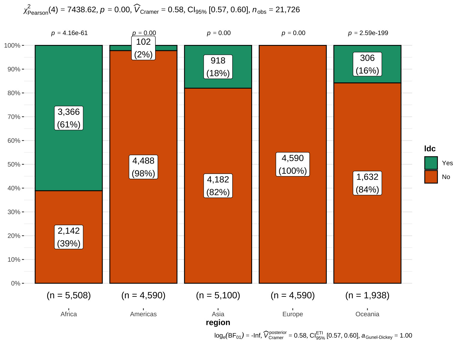
Exploratory Data Analysis (EDA)
Analyzing the 2022 country-level World Population Prospects (WPP 2022) data to summarize their main characteristics of variables, often with visual graphs, without using a statistical model.
Overview of the data
Understanding the dimensions of the data set, variable names, overall missing summary and data types of each variable.
Summary of the data
The initial overview provides a summary of the dataset’s dimensions and the types of variables it contains. This includes the number of rows and columns, the types of variables (numeric, factor, text, etc.), and the percentage of complete cases.
Structure of the data
This section delves deeper into the structure of the data, detailing each variable’s type, the number of samples, missing values, and the percentage of missing data.
This information is crucial for understanding the overall data quality and identifying potential issues. This allows to evaluate the reliability of subsequent analyses. Each variable’s data type (e.g., numeric, character) is correctly identified, which is essential for appropriate statistical testing and modeling.
Summary of numerical variables
This summary provides key statistical measures for all numeric variables, including measures of central tendency (mean, median) and dispersion (standard deviation, interquartile range), as well as skewness and kurtosis to understand the distribution shape.
The summary statistics highlight the central tendencies and dispersion of the numeric variables. For instance, variables with high skewness and kurtosis values might indicate outliers or non-normal distributions, which may require transformation or special handling in modeling.
Numerical summaries by geography
Distributions of numerical variables
Graphical representation of all numeric features
Quantile-quantile plot (Univariate)
The quantile-quantile plot helps in assessing whether the numeric variables follow a particular distribution, such as the normal distribution. The Q-Q plots allow us to visually assess the normality of the numeric variables. Deviations from the diagonal line suggest that the data may not be normally distributed, which could impact parametric statistical analyses.
$`0`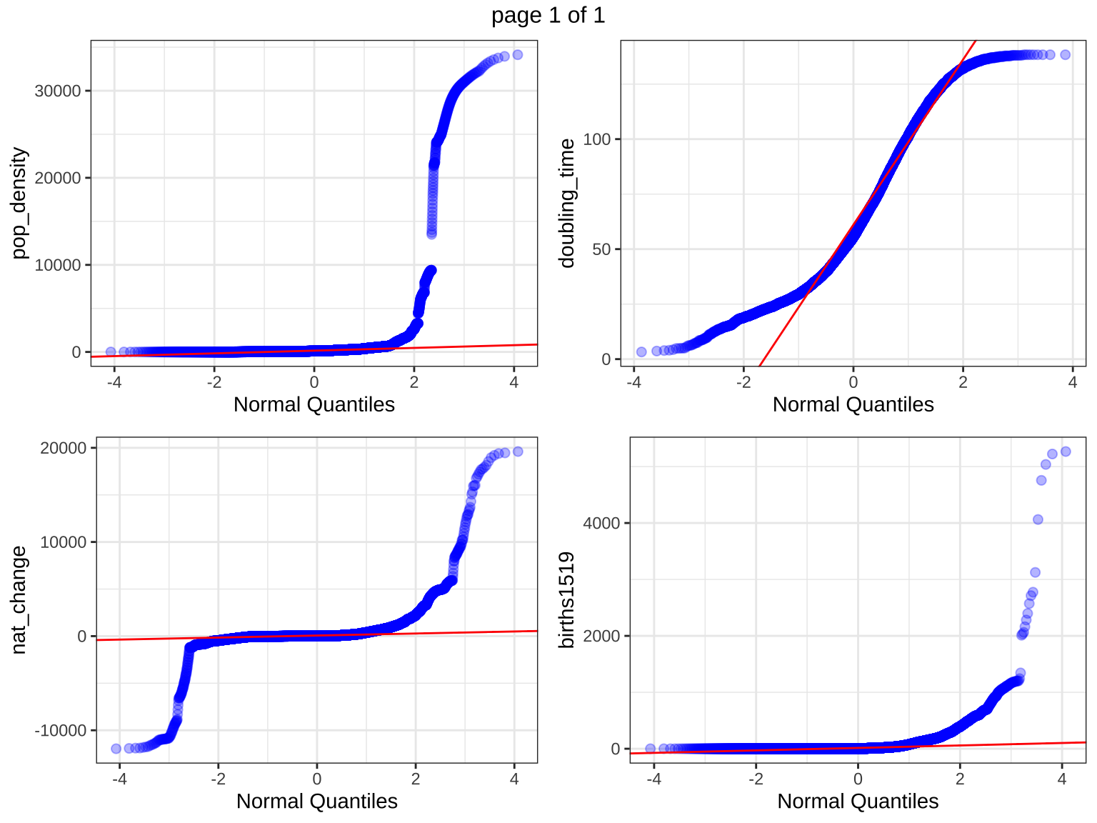
Density plot (Univariate)
Density plots provide a smoothed estimate of the data distribution, allowing for easy visualization of the distribution shape and comparison between different variables.
Density plots show the distribution of each numeric variable. Peaks in the density plots indicate modes, and the spread indicates variability. These plots help in understanding the distribution and identifying any potential skewness or multimodality.
$`0`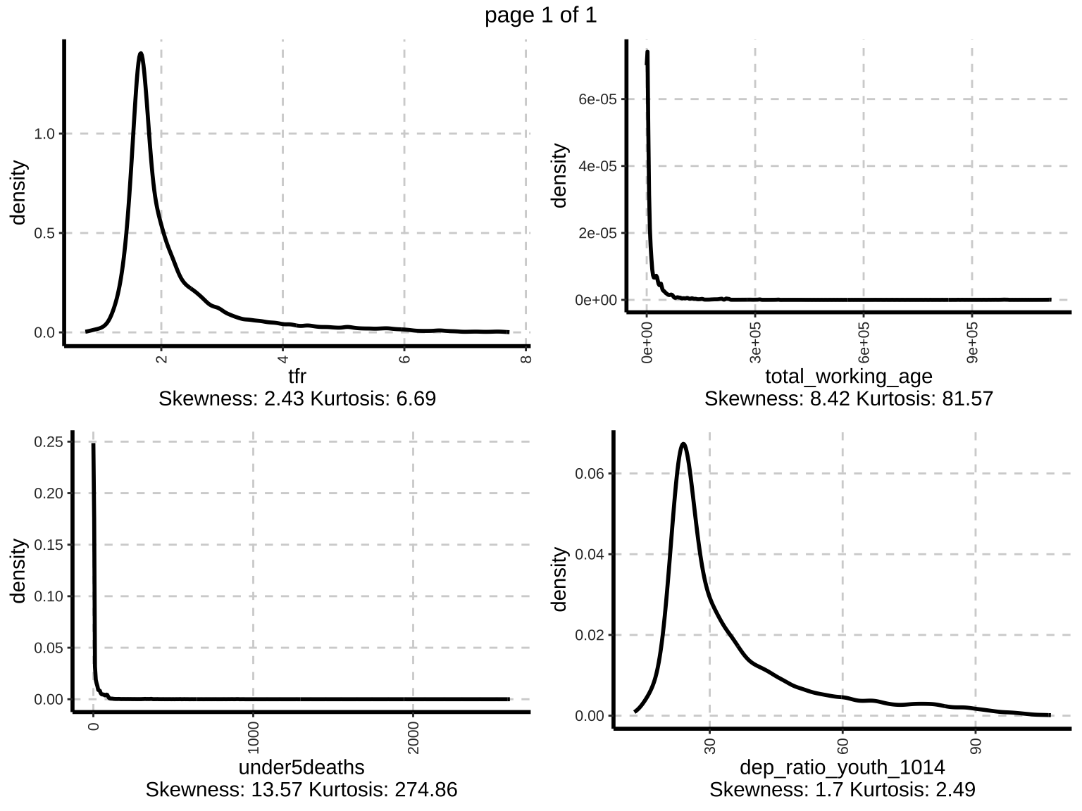
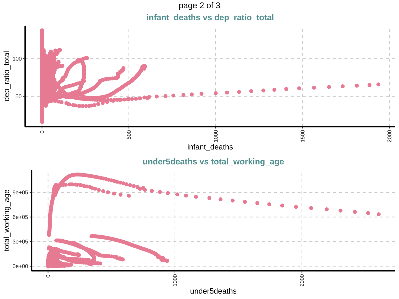
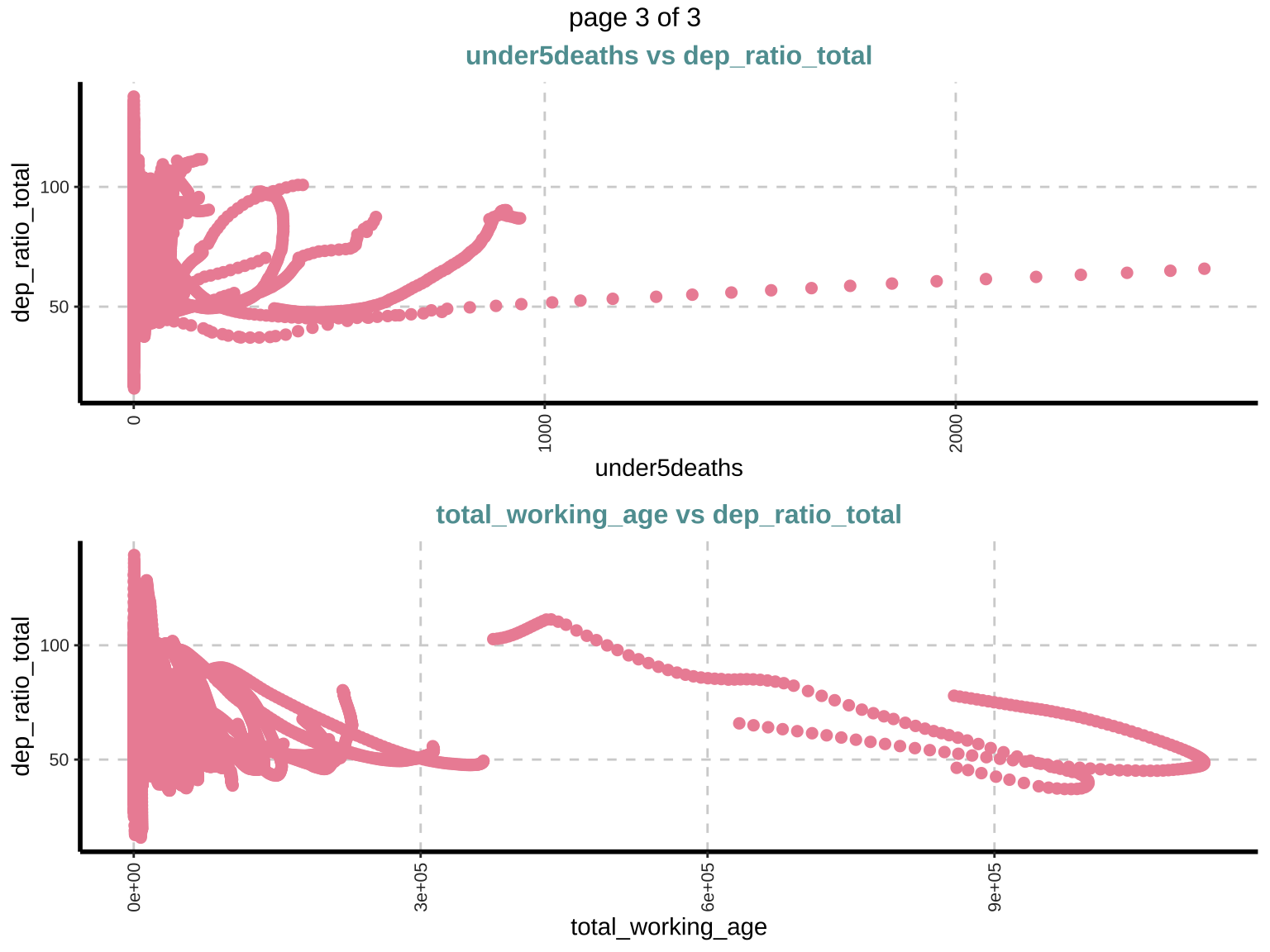
Scatter plot (Bivariate)
Scatter plots are used to explore the relationship between pairs of numeric variables, helping in identifying potential correlations or patterns. Positive or negative trends can indicate correlations. Outliers and patterns in these plots provide insights into the data structure and potential interactions between variables.
$`0`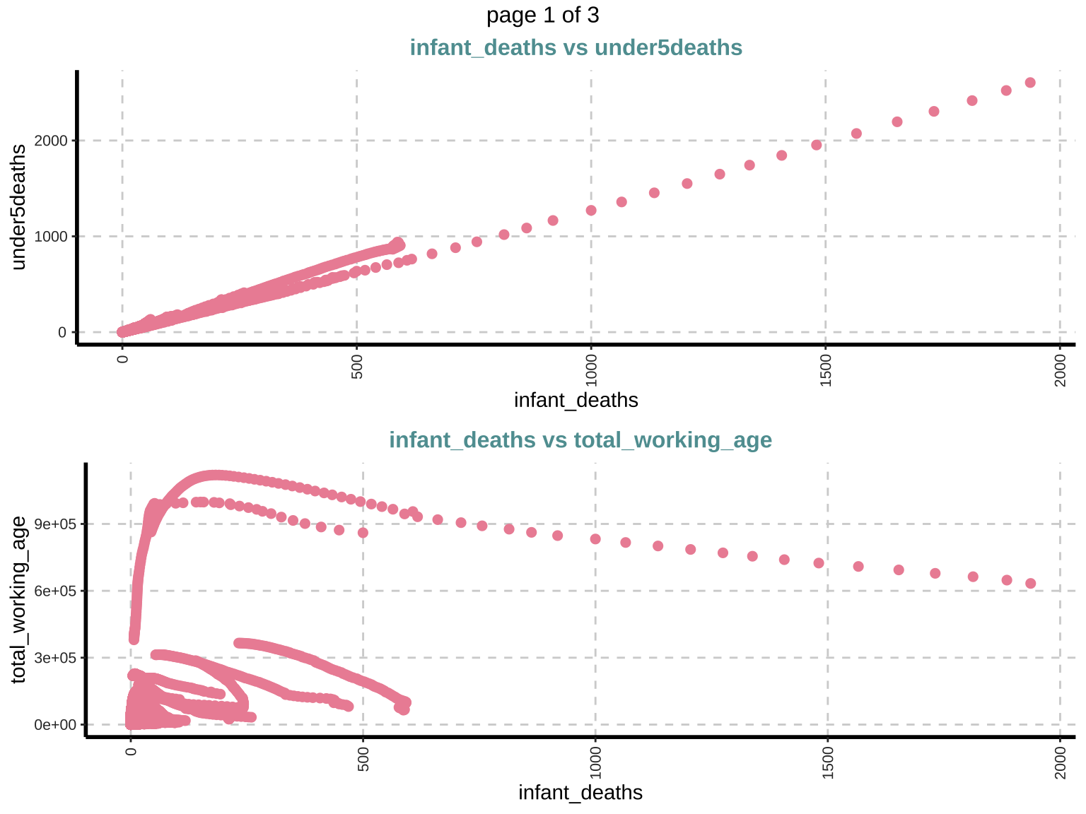
Summary of categorical variables
Summary statistics for categorical variables provide information on the frequency and proportion of each category within the variable.
Frequency for all categorical independent variables
This section provides a frequency table for all categorical variables, showing the count and percentage of each category within the variable. The frequency tables indicate how often each category occurs in the dataset. This is crucial for understanding the distribution of categorical variables and identifying any categories that might dominate or be underrepresented.
Distributions of categorical variables
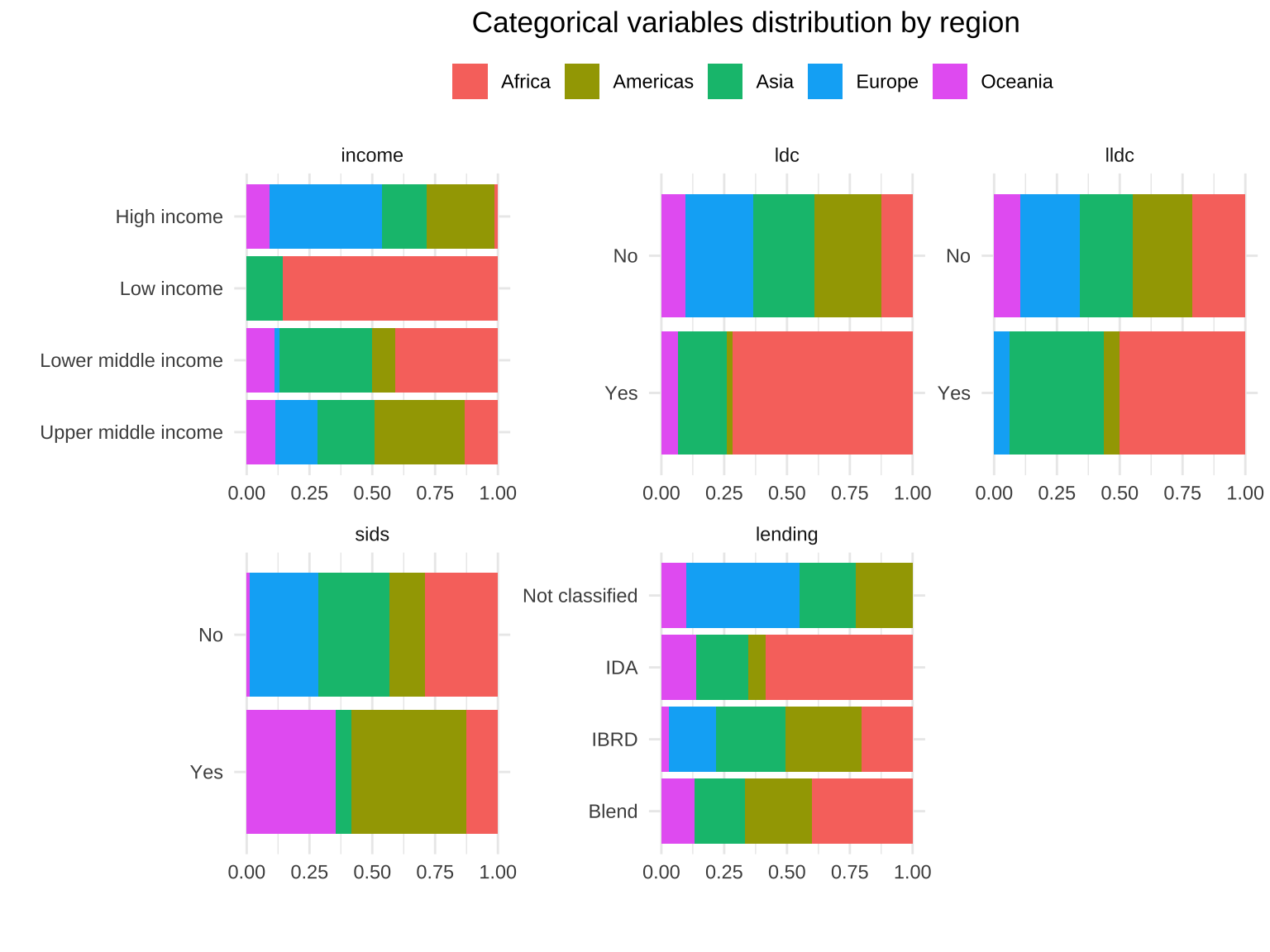
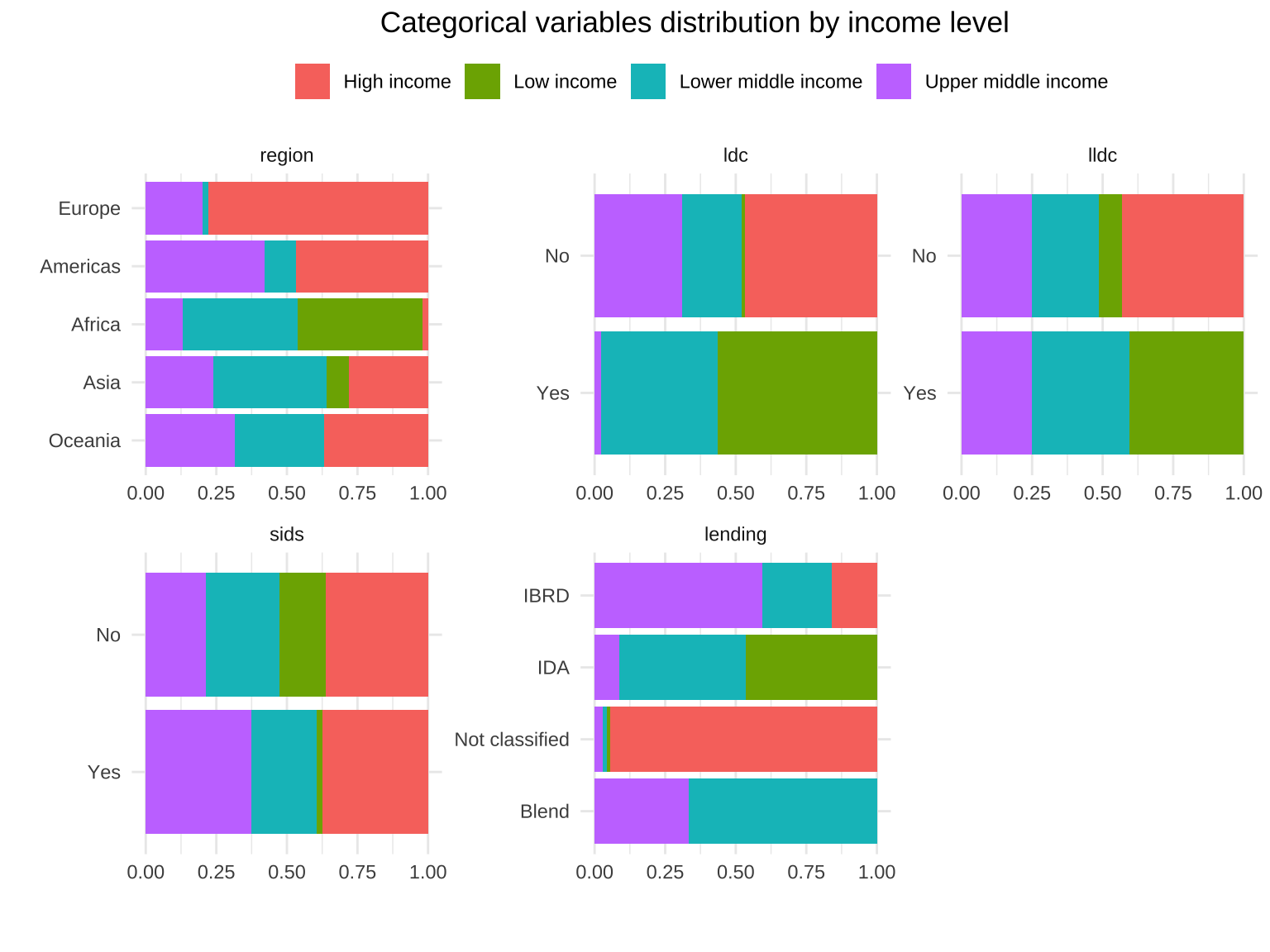
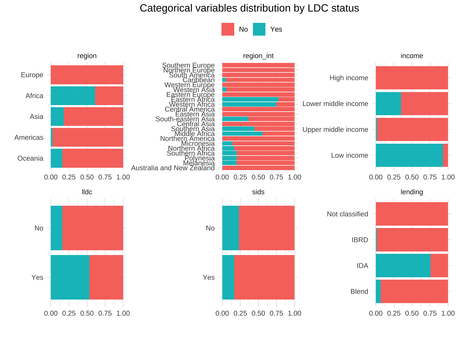
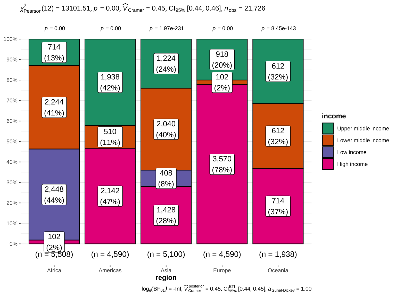
Bar plots for all categorical variables visualize the distribution of categories within each variable, making it easy to see which categories are most or least common.
Bar plots with vertical or horizontal bars for all categorical variables
The following section identifies and visualizes categorical variables with fewer than 11 unique values using bar plots. This is particularly useful for variables with a manageable number of categories.
Bar plots provide a visual representation of the categorical variables’ distributions. This helps in quickly identifying the most and least common categories. Such visualizations are useful for understanding the data’s structure and for subsequent analyses like feature selection.
